iOS 27 is coming. Apple just announced it at WWDC. We’re told the general public gets it in the fall. But wait. Don’t forget iOS 26 dropped back in September 2026. It’s sitting in your updates. Probably unused. It brought real customization to the lock screen that most people haven’t touched yet.
Since iOS 18 in 2024 we could hide those pesky controls. Good riddance if you’ve ever flashed a light into a stranger’s eye because your phone bumped in your pocket. That was nice. But 26 took it further. Now you move widgets. You blow up the clock. You add 3D depth to pictures.
Here is what you can do with the lock screen right now.
Зміст
The Big Clock
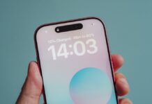
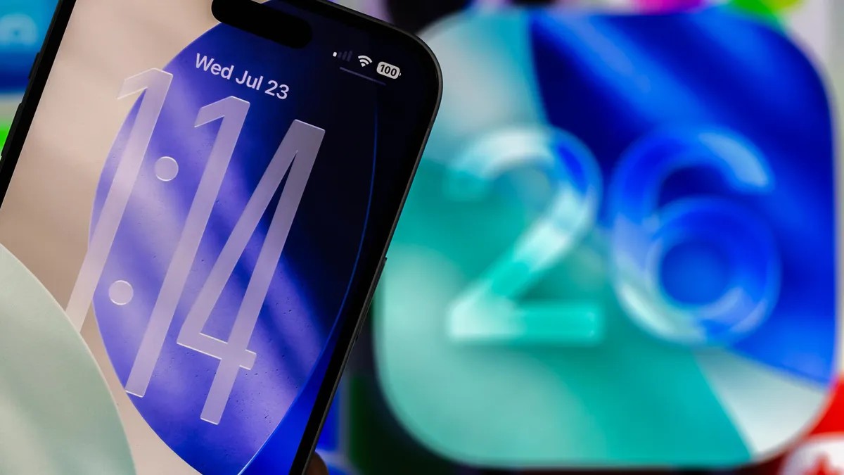
This is the headline feature. You can expand the clock until it chews up roughly a third of your display.
Why? Because seeing time without glasses is a luxury. If I lay the iPhone 16 Pro on a table it reads like a bedside alarm.
- Go to Settings.
- Hit Wallpaper.
- Tap Customize on your current screen.
The UI lights up with outlines. Find the thick tab on the bottom-right corner of the clock rectangle. Drag it down. Expand away.
Once it’s huge tap it to swap between Glass or Solid. You can tweak color and weight too. There’s a catch. The font stays locked. You can stretch the size but Apple hasn’t unlocked the typography yet. Maybe next year.
“Only the far left clock font can be extended right now.”
Moving the Widget Dock
The dock usually lives above the camera controls. Now it doesn’t have to.
Go back to Settings > Wallpaper > Customize. Grab that dock and drag it to the bottom.
If you blew up the clock the system forces the dock down there automatically. You can’t move it anywhere else then. The layout logic is rigid when space gets tight.
Spatial Scenery
Apple calls them “Spatial Scenes.” I call them trippy depth maps.
Photos on your lock screen pop out in 3D. Move your wrist around and the elements shift. It gives a cheap but cool parallax effect.
How to do it.
* Settings > Wallpaper.
* Tap Customize.
* Hit the hexagon icon in the corner.
It works with photos. Not the stock Apple wallpapers. Forget the emoji collections or weather widgets for this. Bring your own pic.
Color in the Controls
Small stuff. But noticeable.
iOS 26 changes how controls render. You don’t toggle anything new. You just add a control with color. The system highlights it automatically.
Less Control From Cupertino
Apple used to lock us in tight. Slowly the handcuffs came off.
We get more leeway with the dock position. The clock size. The wallpaper depth. Is it enough? No. You still can’t put that dock in the top left corner if you really wanted to.
But they keep opening doors.
Why does Apple care this much about a screen we unlock and leave in three seconds? Maybe because those three seconds define the rest of the hour.