Microsoft has always been a titan in software. It started with MS-DOS, the operating system (OS) that powered the early personal computer revolution. An OS is the bedrock of computing. It lets applications talk to hardware and manage resources like memory and storage.
MS-DOS worked. But it was harsh. You had to type commands into a black screen. There were no pictures. If you didn’t know the specific keystrokes to navigate file folders, you were stuck. It wasn’t built for humans who had never touched a keyboard before.
The shift began in 1983. Microsoft started building a graphical user interface (GUI ). The idea was simple. Replace text commands with images. Click an icon instead of typing a directory path. The goal was accessibility. Make it so intuitive that a novice could figure it out without reading a manual.
This move paid off. Windows became the dominant force in corporate computing. Some versions, like Windows XP, lasted for years. Others, like Windows Vista, stumbled under the weight of early bugs and criticism.
Then came Windows 8.
This version wasn’t an update. It was a departure. It introduced a radical new interface designed for a world moving toward touchscreens. Here is how that shift changed the experience.
Зміст
A PC OS for a Post PC World
Windows 8 offers two distinct layouts. First, there is the traditional desktop. This looks familiar. You have shortcuts, icons, and programs that launch when clicked. If you’ve used Windows in the last decade, this part feels normal.
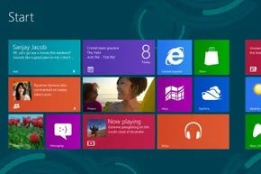
The real change is the tiled interface. Formerly called Metro, this design mimics a tablet or smartphone screen. This wasn’t accidental. PC sales were dropping. Customers were turning to mobile devices. While phones got better, they still couldn’t handle all the heavy-duty software that a full PC could run.
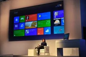
Microsoft tried to bridge that gap. The new interface optimized for touch. It allowed Windows 8 to function across platforms. If you had a touch-screen device, navigation was physical. Tap a tile to open an app. Swipe to move between screens. Pull from the edge to access the Charms menu, which housed tools like search.
Non-touch users weren’t left behind. You could use the tiled interface with a mouse and keyboard. Instead of swiping, you clicked activation points on the screen’s edge. A scroll bar at the bottom let you move left and right through the tiles.
These weren’t just static icons. Microsoft introduced “live tiles.” Developers could push notifications to these tiles even when the app was closed. You saw updates without opening the software.
Windows RT and Hardware Limits
Microsoft also created a specific version called Windows RT. This was designed for devices with ARM-based processors. Standard Windows 8 required Intel chips. Windows RT kept the look of the tile interface but stripped away most desktop applications. It relied almost entirely on apps.
This split in the ecosystem raised questions about compatibility and the future of software distribution.
Apps Versus Software
The distinction between a traditional program and a modern app became central to the Windows 8 experience. Traditional software ran in the background. It accessed system resources directly. It often required installation from a disc or a downloaded installer file.
Apps in the new model were more contained. They operated within a sandboxed environment. This meant they had limited access to certain system files. The trade-off was security and stability. But it also meant less flexibility.
For developers, this meant rewriting code. Old software couldn’t just be ported over. It had to be adapted to the new model. Many legacy programs simply didn’t work on Windows RT. On standard Windows 8, they often required a different installation path or a compatibility mode.
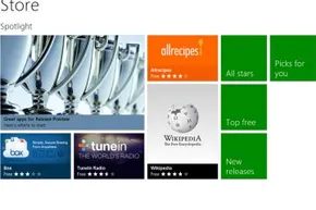
Users had to adapt their expectations. You didn’t just “install” things anymore. You browsed a store. You tapped to download. The flow of software acquisition changed. And with it, the relationship between the user and the machine.
The desktop remained. But the start screen pushed you toward a different way of thinking. It forced a shift in how you navigated information. It wasn’t about finding a folder. It was about accessing a stream of content.
Did this work? The market was split. Some loved the clean, modern aesthetic. Others missed the predictability of the old start menu. The transition was jarring for many. But it laid the groundwork for what came next.
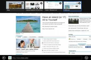
The tiled interface in Windows 8 isn’t just a pretty screensaver. It’s a distinct environment designed for a specific type of software. People often use the word “app” and “software” interchangeably. In Windows 8, they mean different things. This distinction matters because it dictates how programs are built and how you interact with them.
How Windows 8 apps are designed
An app is generally straightforward. It installs quickly. It does one thing or a few things well. The feature set is usually limited by design. Why? Because a smaller scope keeps the file size down. It also prevents the user from getting lost in a maze of settings. Developers optimize these apps to leverage the strengths of the operating system.
If Windows 8 were exclusive to tablets and touchscreens, the design would be simpler. You’d only need to account for finger taps and swipes. But Windows 8 runs on everything. It runs on desktops with mice and keyboards. This dual nature forces developers to build for two input methods simultaneously.
Where traditional software lives
When we say “software” in this context, we aren’t talking about light utilities. We mean the heavy hitters. Large, complex programs. These tools often require deep menu structures. They rely on complex keystrokes. They simply don’t fit inside a tile.
These programs belong on the desktop. The desktop environment supports full-featured applications. Some of these have simplified counterparts in the store, but the desktop version retains all the power. The interface looks familiar if you’ve used Windows since the 90s. It feels like home. It is not.
The missing Start button
One major change in the desktop mode is the absence of a Start button. Microsoft removed it. It debuted in Windows 95 and stayed for decades. Its disappearance can feel jarring.
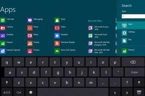
You don’t lose functionality though. You just access it differently. The Start screen in the tiled interface handles much of that job. Press the Windows key on your keyboard to switch between the desktop and the tile world. If you don’t have that key, hover your mouse to the bottom-left corner of the screen. A small icon appears there. Click it to jump to the start screen.
Why legacy software still matters
The desktop isn’t just a fallback. It’s a necessity for backward compatibility. Many older programs have no modern app equivalent. They cannot run inside the tiled interface. You might rely on specific legacy tools for your work. The desktop ensures those programs still function. This keeps Windows 8 relevant for users who can’t afford to switch to new software overnight.
Snapping tiles
The ability to snap apps side-by-side is a key feature of the tiled interface. It allows you to view two apps simultaneously. This is useful for comparing data or referencing information while working in another app.
The gap between how you interact with a PC and a phone isn’t just cosmetic. On a desktop, you expect to juggle windows. You drag, resize, and layer them until your screen is a chaotic mosaic of spreadsheets, browsers, and chat windows. The operating system acts as a traffic cop, directing processor cycles and RAM to whichever process screams loudest for attention. It’s resource-heavy. If you’re running a video editor while compiling code and streaming music, your fans will spin up and your frame rates will drop.
Mobile is different. Most smartphone OSes force a single-app focus. You swipe away one interface to bring up another. There is no native “window” to resize. You see one thing. Then you see another.
Snap vs. Tiled: The Middle Ground
Windows 8 tried to bridge this divide with its tiled interface. It looked like a mobile dashboard but ran on a machine built for multitasking. If you wanted true desktop behavior, you could still get it. But for those who liked the big-tile aesthetic, Microsoft introduced a compromise called Snap.
Snap allows you to pin a background application to the side of the screen. The foreground app takes up roughly two-thirds of the display. The background app gets the rest.
It’s not a full window. You don’t get the same level of control. Some features might be grayed out or completely hidden in the snapped state. Notifications might be the only thing visible. You can snap a desktop window to the side, too, giving you a split-screen view of your open programs. It mimics the tabbed behavior of older browser eras but forces a stricter hierarchy. You are always looking at one primary thing and one secondary thing.
Living With Your OS In the Clouds
Cross-device consistency used to mean buying a USB drive. You’d copy files, walk to another room, plug it in, and copy them back. That’s dead.
The shift to cloud synchronization changed the game. The “cloud” is just a polite term for someone else’s computer connected to your devices. In Windows 8, Microsoft tied your identity to a Microsoft account. Sign in on any Windows 8 machine, and the OS pulls your data down.
This isn’t a virtual machine. The apps still run locally on the hardware you’re using. You aren’t streaming Excel from a server in Virginia. You are downloading the app binaries and your personal files to the local machine. The benefit? Your settings follow you.
Want your wallpaper, language pack, and default browser settings to look identical on your work laptop and your home desktop? The cloud handles that. It even syncs browser history. That’s useful for finding a link you bookmarked yesterday. It’s also a privacy risk if you leave an unattended machine logged in with full sync enabled.
The Internet Requirement
This convenience comes with a catch. You need a network connection to initialize the sync. If you’re offline, you’re local. Chrome OS takes this further, relying almost entirely on cloud storage. If the internet drops, a Chromebook becomes a brick for most tasks. Windows 8 is more forgiving, but the “seamless” experience breaks without connectivity.
Tools and Tips for Apps
Steve Ballmer’s legendary “Developers, Developers, Developers!” rant wasn’t just hype. It was a signal. Microsoft genuinely wanted builders in the room. For Windows 8, they didn’t just leave the door open; they built a house with three distinct entryways.
If you’re looking to create software for the new OS, you have to pick your lane.
The Web Developer’s Shortcut
The first path is for the web-savvy. If you already know HTML5, CSS, and JavaScript, you are good to go. This approach is essentially about wrapping a web experience into an app shell. It’s the fastest route to market if your goal is to port a site into a standalone container. The tools are familiar. The transition is smooth. But it’s not the only way.
The Traditional Coders
Then there’s the heavy lifting. C++, C#, and Visual Basic. These languages let you dig deeper. You aren’t just styling pages; you’re building Silverlight, .NET, and Windows Presentation Foundation (WPF) applications. This is for developers who need more control over the underlying mechanics. It’s steeper learning curve. Higher potential payoff in terms of performance and native integration.
The Graphics Powerhouse
The third option is DirectX. This is for multimedia powerhouses. Games. Video editors. Anything that needs to push pixels hard. Under the hood, this still relies on C++ and HLSL (High-Level Shading Language), but the interface is built for speed and graphical fidelity. It’s a different beast entirely.
The Tools of the Trade
To touch any of these, you need the kit. Windows 8. The free developer tools. Visual Studio. The Software Development Kit (SDK). And a free developer license. Microsoft doesn’t charge you to build. They charge you to sell.
Designing for Touch
Microsoft didn’t just guess how people interact with tablets. They ran focus groups. They watched people swipe, tap, and pinch. They looked for patterns. Where do fingers naturally rest? Where do they slip off?
They baked these findings into the OS. The grid layout isn’t just aesthetic. It’s functional. It’s a guide for arranging graphics and text so the app feels native. You can access this research directly. It’s there to help you optimize for Windows 8 specifically. If you ignore it, your app will feel clunky.
The Gatekeepers
Once you’ve built it, tested it, and polished it, you submit. Windows Store review isn’t a formality. It’s a check. Microsoft ensures your app doesn’t crash the system. They ensure it doesn’t violate policy. If it passes, it’s live.
The Cost of Doing Business
Monetization is where the rubber meets the road. You can charge upfront. You can do in-app purchases. You can run ads. But Microsoft takes a cut.
The standard fee is 30%. It’s steep. It’s standard for mobile and desktop app stores, but it still stings. However, there’s a ladder. If your app generates $25,000 in revenue, the fee drops to 20%. It’s an incentive to grow. But the first $25k? That’s the grind.
“Microsoft gets 30 percent of the revenue generated by an app.”
It’s a business. You’re renting shelf space. The question is whether your app is worth the rent.
If you dig past the Start screen and the tile interface, Windows 8 is technically version 6.2. Microsoft assigns these numbers internally. Windows XP sat at 5.1. Vista was 6.0. Windows 7 was 6.1. The jump to 6.2 seems arbitrary to anyone who just wants to run their apps. But the mismatch between the marketing name and the internal version number serves a specific, technical purpose.
How Version Numbering Prevents Application Errors
Some software developers draw a line in the sand. They set an upper limit on the OS version their code can handle. An application might be coded to run smoothly on a 6.x machine but crash or behave unpredictably on a 7.x computer. By keeping the major version number in the 6.x range, Microsoft prevents these immediate breakages.
Why would developers set limits? Some argue it’s a cynical sales tactic to force upgrades. It creates friction for staying on older hardware. But there is a more functional reason. Many programs rely on specific operating system features. Checking the version number is a lazy shortcut. It ensures those underlying features exist without writing complex detection code.
Microsoft advises against this approach. The company urges developers to create tests to check for specific features instead of looking at the OS version number.
Checking for features directly is harder. It requires more development time. But it’s the only way to ensure compatibility without breaking on future updates. Using version numbers as a proxy is a fragile strategy. It fails when Microsoft updates the OS while keeping the same major version.
Windows 8 Hardware Architecture Requirements
Windows 8 is built for Intel processors. Specifically, it requires either a 32-bit or 64-bit architecture. An architecture defines how the processor moves operations and data. If your chip uses a different instruction set, Windows 8 simply will not run. This is a hard boundary. You cannot bypass it.
To get the OS running, you need specific hardware. The bar is low by modern standards, but it was significant in 2012. Your machine needs:
- A processor of at least 1 gigahertz (GHz)
- 1 gigabyte (GB) of RAM for the 32-bit version
- 2 GB of RAM for the 64-bit version
- 16 GB of hard-drive space for 32-bit
- 20 GB of hard-drive space for 64-bit
- A graphics card with a Windows Display Driver Model (WDDM) driver compatible with DirectX 9
These are the minimums. They get the system to boot. They don’t guarantee a good experience.
Touch Interface and the Shift to Mobile
You can use a mouse with Windows 8. But to really use it, you need a touch interface. Microsoft designed the entire interaction model around fingers on a screen. The tiles, the charms bar, the snap views—none of it works well with a cursor. This shift wasn’t just about Windows 8. It was a signal of where computing was heading. Smaller form factors. More mobile devices. The desktop was becoming just one option among many.
Did the strategy work? The operating system struggled to connect with users. The removal of the Start menu caused confusion. The hybrid interface split opinions. Microsoft released updates to patch the holes, but the momentum had shifted. Windows 10 eventually succeeded it, doubling down on the features that worked and abandoning the ones that didn’t.
Frequently Asked Questions
Can I still use Windows 8 in 2022?
Microsoft extended support until January 10, 2023. After that date, no security updates came out. No technical support. Running it today leaves you exposed to threats that haven’t been patched since the Obama administration.
Did Windows 8 fail?
It never gained traction. Users found the interface jarring. The learning curve was steep. Windows 10 succeeded because it offered a more familiar desktop experience while keeping the modern improvements. Windows 8 is largely a footnote in the history of Microsoft’s ecosystem.